Quality learning provides administrators, educators, and students with the thinking and practical quality improvement tools necessary to continually improve schools, classrooms and learning. The Consensogram is one of these powerful and easy-to-use quality improvement tools.
The Consensogram facilitates collaboration to support planning and decision making through the collection and display of data. It can be used to gain important insights into the perceptions of stakeholders (most often relating to their level of commitment, effort, or understanding).
The quick-to-construct chart reveals the frequency and distribution of responses. Although anonymous, it allows individuals to view their response in relation to the others in the group.
The Consensogram gives voice to the silent majority and perspective to the vocal minority.
At QLA, we use frequently use the Consensogram: applying it to diverse situations for the purpose of obtaining important data to better inform ‘where to next’.
How to
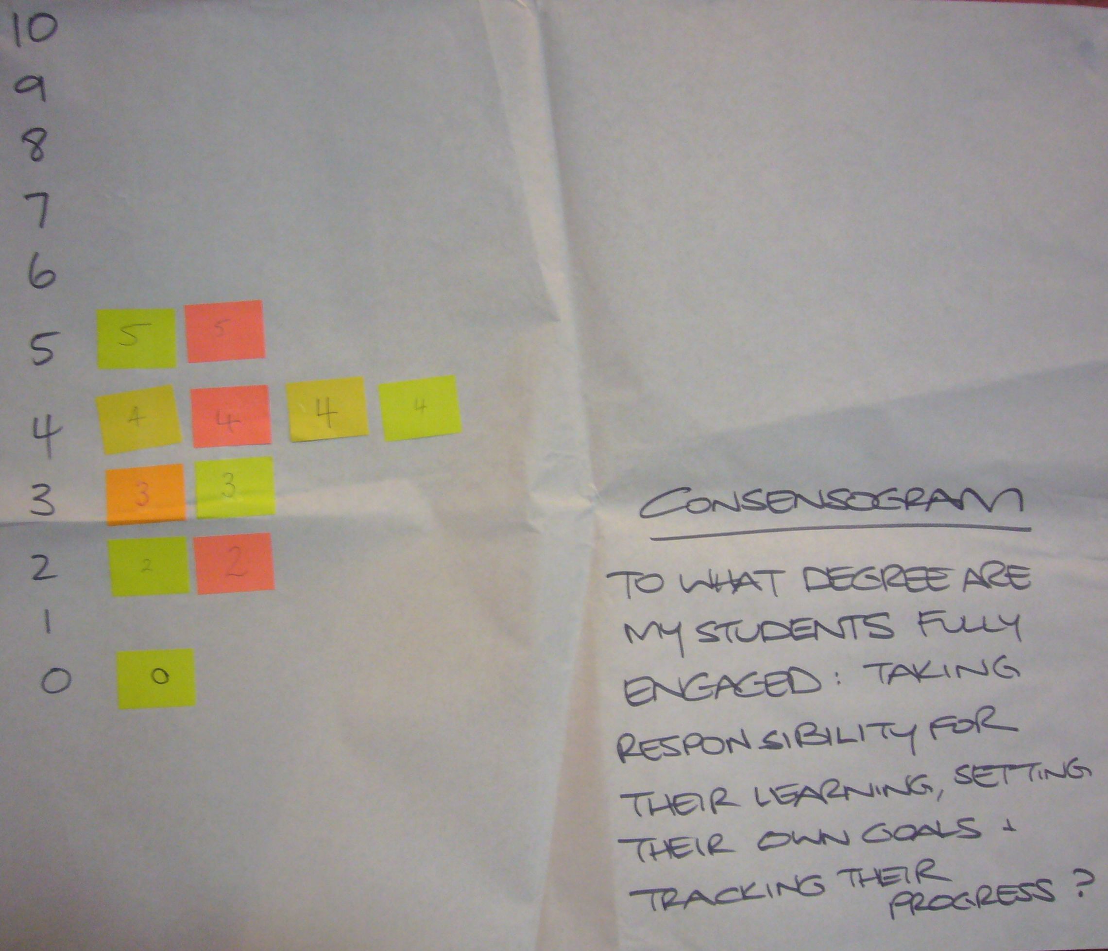
- Predetermine the question relating to the data to be collected. Make sure the question is seeking a personalised response – it contains an “I” or “my” or “me”. We want people to give their view. E.g. “To what degree am I committed to…” or “To what degree do I understand…” It can help to begin the question with ‘To what degree…’
- Predetermine the scale you wish to use. The scale may be zero to 10 or a percentage scale between zero and 100 percent.
- Issue each person with one sticky note. Make sure the sticky notes are all the same size. Colour is not important.
- Explain that you want people to write a number on their sticky note in response to the question posed.
- No negative numbers.
- If using the zero to 10 scale: the number should be a whole number (not a fraction e.g. 3¾ or 3.75, 55%), and a six or nine should be underlined so they can be distinguished.
- If using the zero to 100% scale, the numbers should be multiples of ten percent, i.e. 0%, 10%, 20%, and so on.
- Names are not required on the sticky notes.
- Ask people to write down their response. This shouldn’t take long!
- Collect the sticky notes and construct the Consensogram, usually on flip chart paper. Label the consensogram with the question and a vertical axis showing the scale.
- Interpret the Consensogram with the group and use it to inform what to do next.
- Capture a record of your Consensogram by taking a photograph or saving the data on a spreadsheet. You can use a Consensogram template.
Some examples
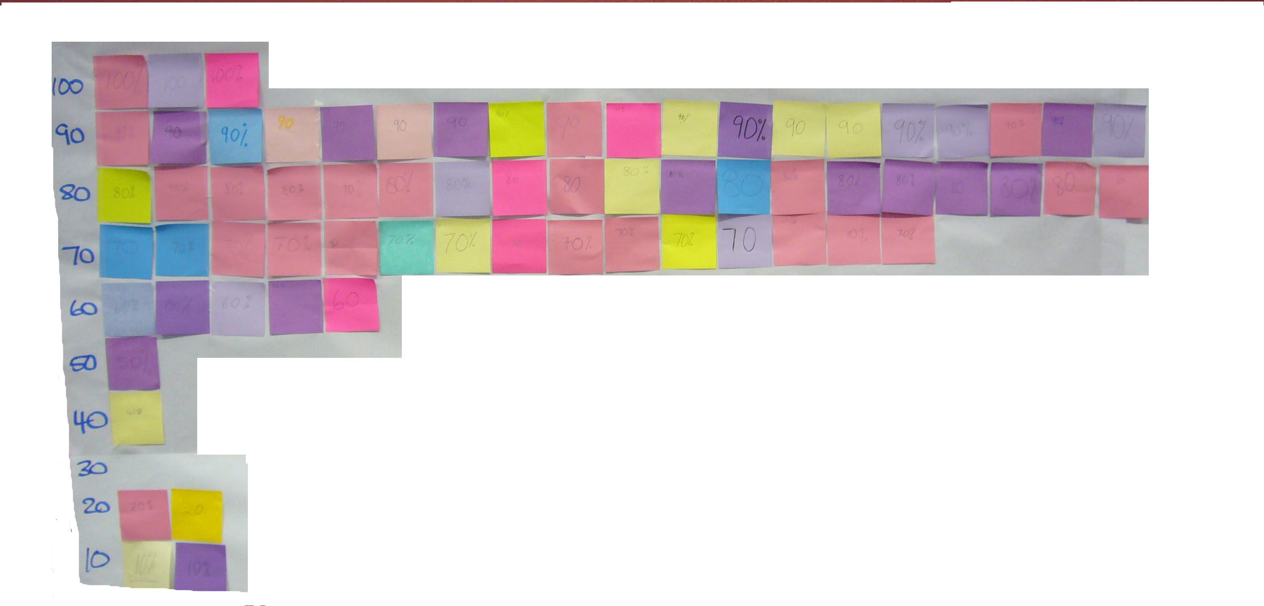
Students feeling prepared for high school
This first example was prepared by a classroom teacher to determine how confident Year 6 students were feeling about their transitioning to high school.
So what do the data reveal?
- There is significant variation; the students believe they are prepared to different degrees for their move to high school (scores range from 10 to 4).
- There is one outlier (special cause) – that is; one student who is having a very different experience to others in the class (giving a rating of one). They report that they feel unprepared for the transition.
So where to next?
- There is opportunity to improve student confidence by working with the whole class to identify and work together to eliminate or minimise the biggest barriers to their feeling prepared.
- There is opportunity to invite the student who is feeling unprepared to work with the teacher one-on-one (case manage) to address their specific needs for transiting. This student should not be singled out in front of the class, but an invitation issued to the whole class for that individual to have a quiet word with the teacher at a convenient time. The ensuing discussion may also inform the transitioning process for the rest of the class.
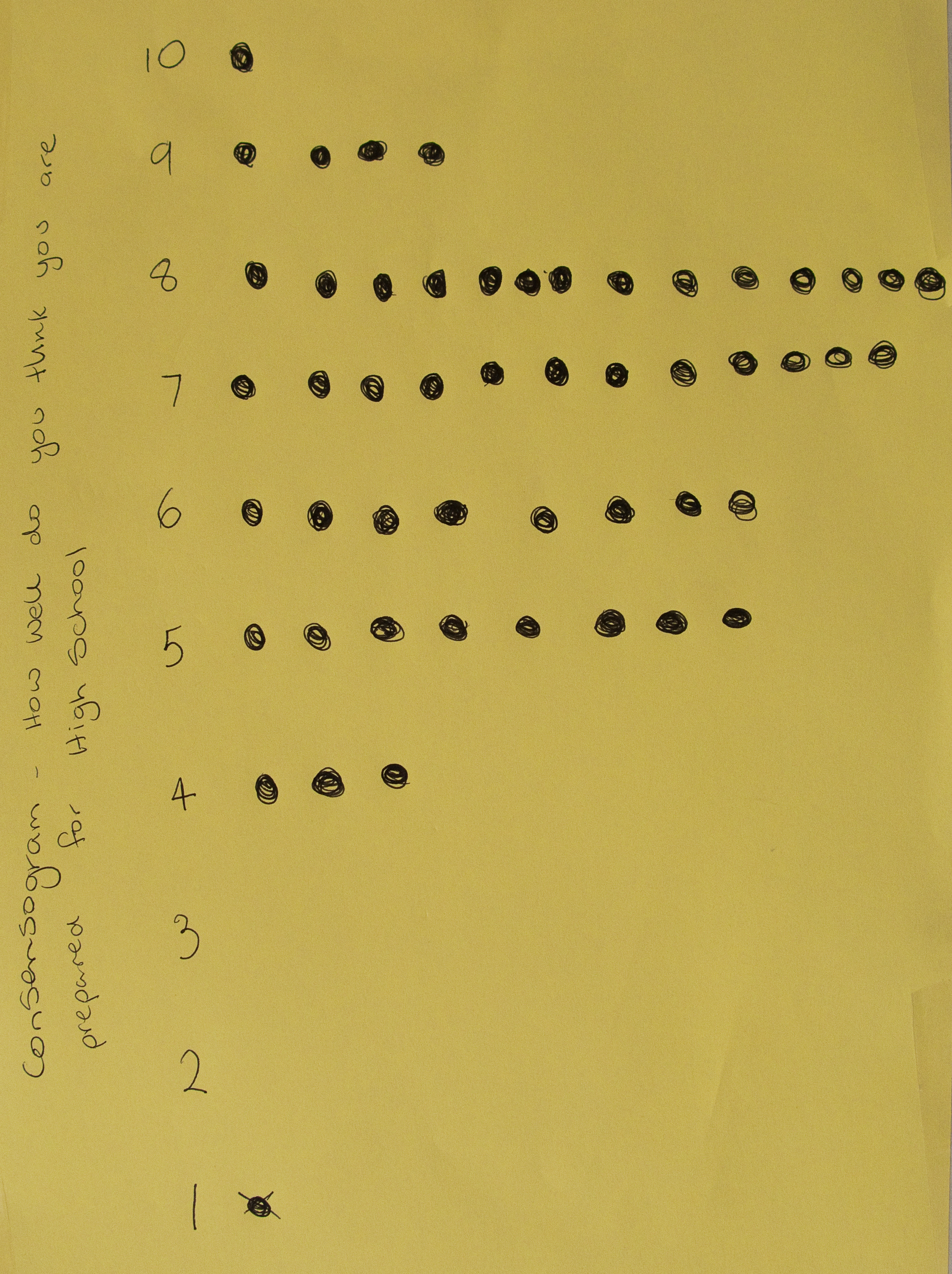
Student engagement
This example was created during a QLA professional development
workshop with a small group of 11 teachers.
The question was: “To what degree are my students fully engaged: taking responsibility for their learning, setting their own goals and tracking their progress?”
So what do the data reveal?
- There is variation; the teachers believe their students are at different levels of engagement in their classroom.
- The data appears normally distributed data (a bell curve); there are no outliers (special causes) – that is; none of the teachers are having a very different experience to others in the group.
So where to next?
- There is opportunity to improve student engagement; all of the data points are below 5 on the scale.
- This data can help the group to understand the agreed current state and can motivate people to engage with improvement. It can also provide baseline data to monitor the impact of improvement efforts in the future.
Commitment to school purpose
This example was created during school strategic planning with key stakeholders of a small school (parents, staff and students). A draft
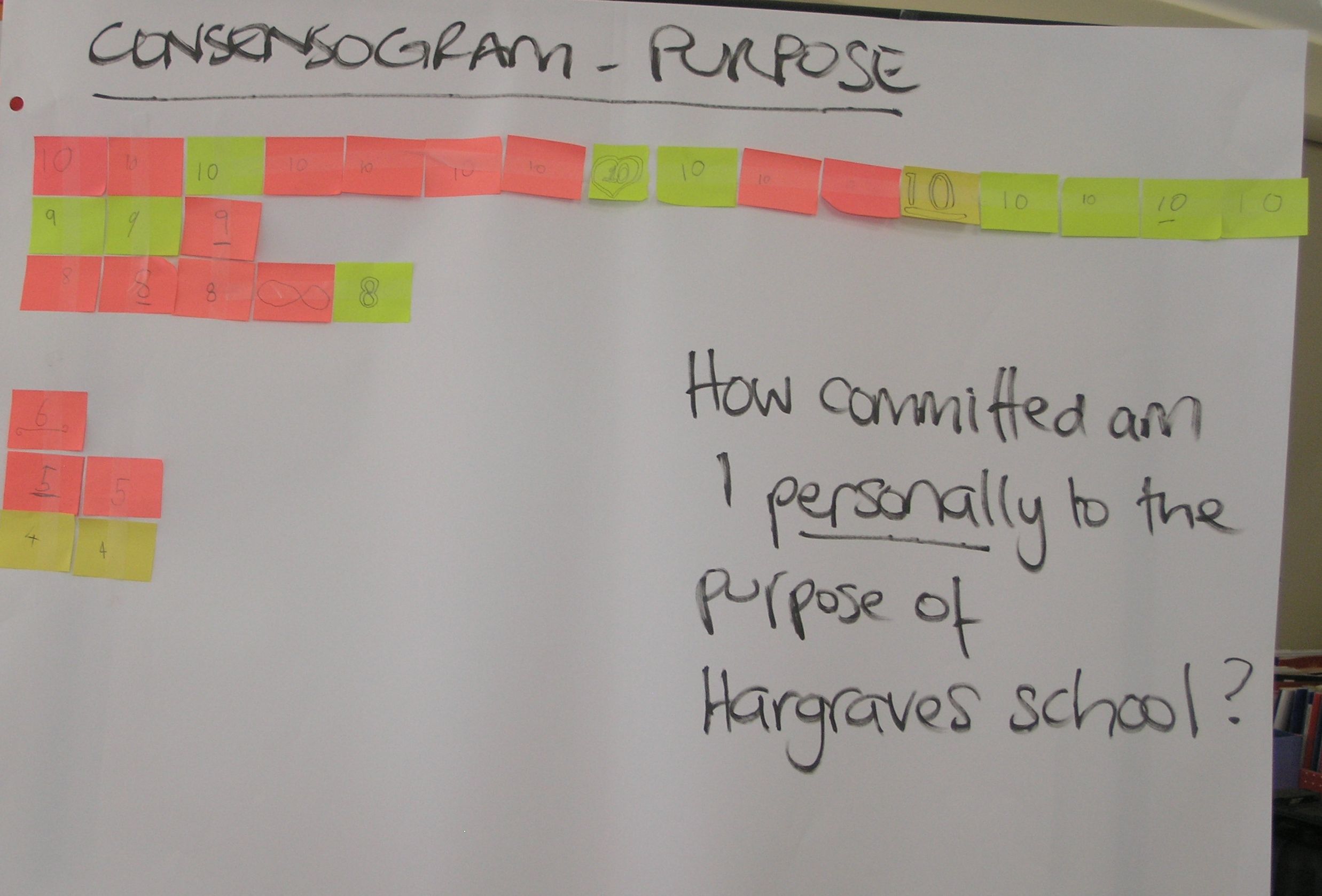
purpose statement was developed using stakeholder input (using a P3T Tool). The Consensogram was then used to measure the level of commitment to the draft statement. The question was: “How committed am I personally to the purpose of the school?”
The use of the Consensogram averted the need for long, frequently unproductive dialogue. It revealed the following:
- There is variation; the stakeholders exhibit different levels of commitment to the school purpose.
- Most are stakeholders are highly committed (the majority indicating a commitment level of 8-10).
- A group of five stakeholders are less committed (a commitment level of 4-6). Their experience may be different to others in the group.
So where to next?
- This presents an opportunity to invite the stakeholders with a different experience to share. It is very likely something can be learned to improve the purpose statement for everyone.
Learn more…
Watch a video example of a Consensogram being used for school planning (Hargraves System Mapping) on YouTube.
Investigate the key quality improvement tools and concepts underpinning the use of the Consensogram, plus more examples in Improving Learning: A how to guide for school improvement.
Purchase a Using data to improve guide.
Download a Consensogram MS Excel template.
One thought on “How to gauge consensus – use a Consensogram”