Sometimes it’s desirable to gather views on more than one issue, and to examine the relationship between responses to these issues.
A Correlation Chart is useful for examining the relationship between responses.
Correlation Chart
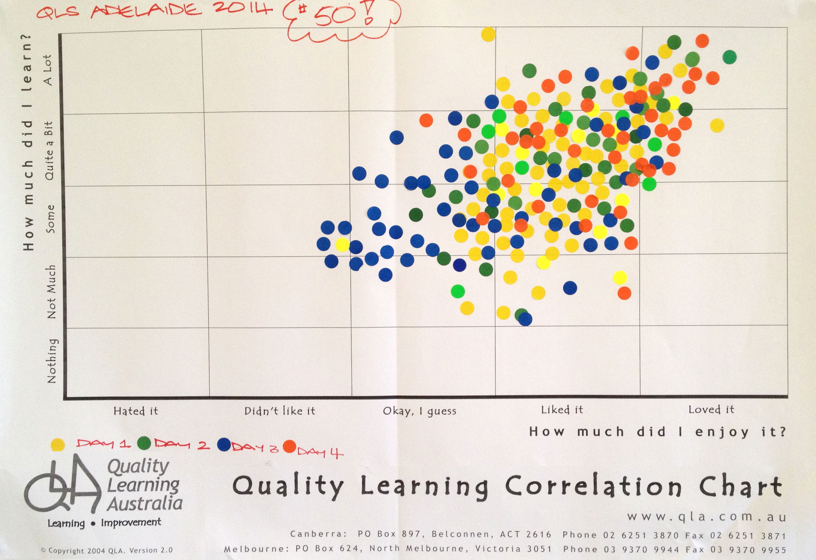
We regularly use a Correlation Chart as a quick and effective way to gather feedback from participants in our workshops. Figure 1 shows a Correlation Chart from a workshop – the 50th four-day Quality Learning Seminar with David Langford held in Australia.
Figure 1. Workshop participant feedback on a Correlation Chart
Many teachers use a Correlation Chart at the end of a unit of work to gather student feedback on the unit.
Set the questions and scale
The first step when using a Correlation Chart is to decide the questions. The most common question are those shown in Figure 1, namely:
How much did you enjoy the workshop/course/unit of work?
How much did you learn?
The questions must lend themselves to a scaled response.
Binary questions, which have only two responses such as yes or no, don’t work for a Correlation Chart.
Scales we have seen used effectively include:
Frequency: rarely to nearly always
Importance: not important to critical
Performance: very poor to excellent
Amount: nothing to a lot
Disposition: hate it to love it
Knowledge: never heard of it to mastered it
Confidence: not confident to supremely confident.
Whichever scale you choose, respondents will find it helpful if you define ‘anchor points’ along the scale. We typically define five such points. For example, for Frequency:
Rarely (10%)
Sometimes (25%)
Moderately (50%)
Mostly (75%)
Nearly Always (90%)
Gather and display the data
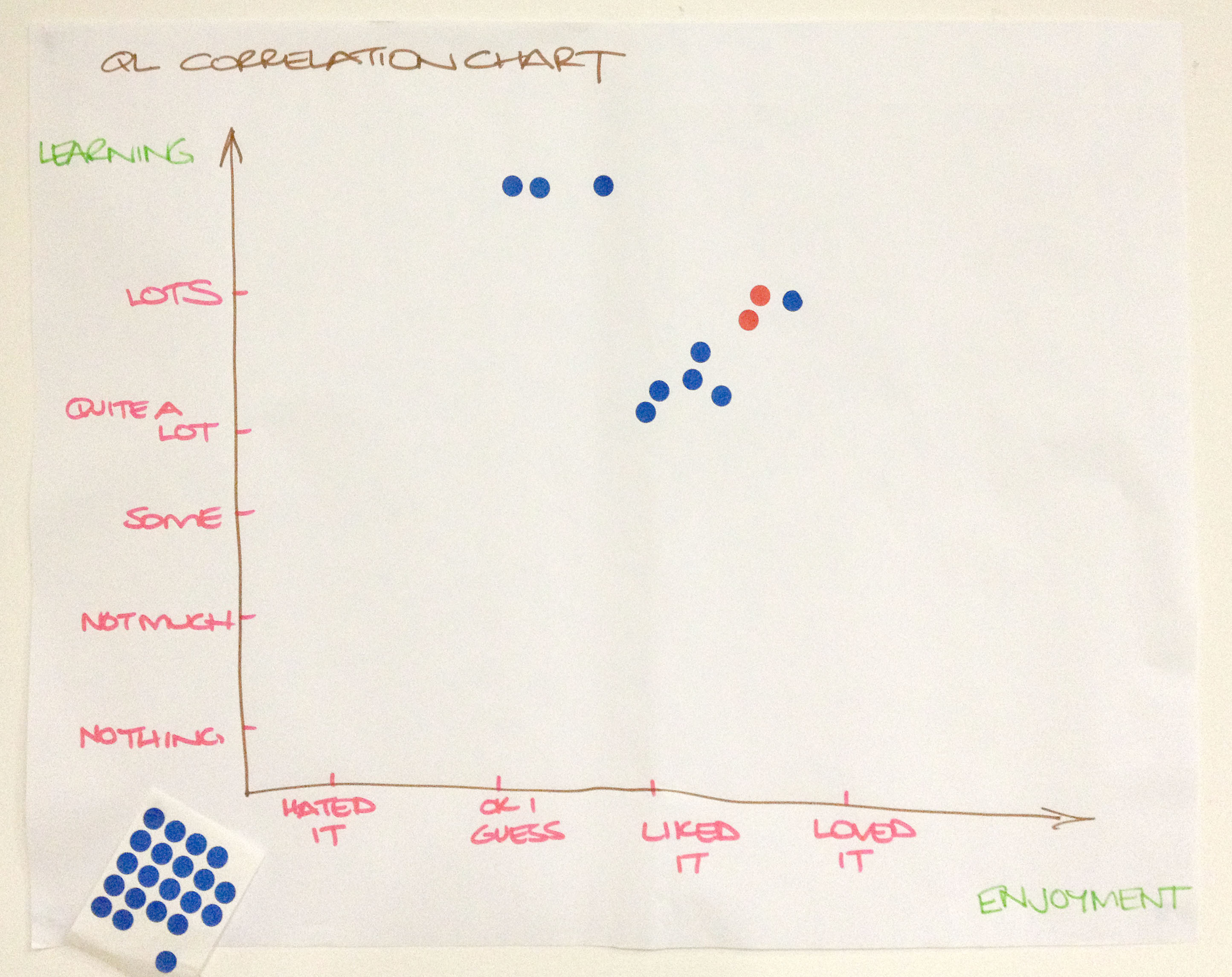
Having determined the questions and scale, the next step is to draw up the correlation chart. It doesn’t have to be typed and printed; hand written charts, such as that shown in Figure 2 work quite well.
Figure 2. A hand-written Correlation Chart
Provide a sheet of adhesive dots (or a marker pen). Invite respondents to place a dot in the chart in response to the two questions.
Consider the relationship
What patterns can you see in the data? In Figure 1, you will notice the tendency for individuals’ ratings of learning and enjoyment to be quite similar. Those who reported they enjoyed the seminar more tended to report learning more. In other words, there is a positive correlation between these variables.
Remember, correlation does not mean causation. Correlation only indicates a relationship exists, it doesn’t explain the nature of the relationship. In Australia, for instance, there is a correlation between sales of ice cream cones and shark attacks; nobody suggests one causes the other.
Decide what to do next
Data inform decisions. We collect data to help us decide what to do next. Be sure to consider what the data are suggesting you need to do.
Benefits of a Correlation Chart
A Correlation Chart is easy to use. It can easily be made during a staff or class meeting, with the results instantly visible for everyone to see. It is much easier than a survey!
Everyone can see their own dots on a Correlation Chart; they know their voice is heard and that their opinion matters.
Like many of the Quality Learning tools, a Correlation Chart gives voice to the silent majority while giving perspective to the vocal minority. People see how their perspective relates to those of others in the group.
Keep in mind
A Correlation Chart does not provide any information regarding the reasons for the responses. Take care not to attribute reasons without further investigation.
Respect the anonymity of the respondents. If there are outlier responses – special causes – that are clearly different to those of the majority, don’t seek to identify the individuals concerned. Rather, invite the individual(s) to have a quiet word with you later so you can understand their perspective. There is frequently richness in the views of outliers.
This is the final in a series of four blog posts to introduce the underpinning concepts related to variation in systems. In the first post we discussed common cause and special cause variation. The second explored the concept of system stability. The third explained system capability. This final post discusses tampering – making changes to systems without understanding variation. Tampering makes things worse! This is an edited extract from our book, Improving Learning.
Stop tampering
Let us begin with a definition of tampering.
Tampering: making changes to a system in the absence of an understanding of the nature and impact of variation affecting the system
The most common forms of tampering are:
overreacting to evidence of special cause variation
overreacting to individual data points that are subject only to common cause variation (usually because these data are deemed to be unacceptable)
chopping the tails of the distribution (working on the individuals at the extreme ends of the distribution without addressing the system itself)
failing to address root causes.
Tampering with a system will not lead to improvement.
Let us look more closely at each of these forms of tampering and their impact.
Tampering by overreacting to special cause variation
Consider the true story of the young teacher who observed a student in the class struggling under the high expectations of her parents. The teacher thought that the student’s parents were placing too much pressure on the child to achieve high grades, which the teacher believed to be beyond the student. The young and inexperienced teacher wrote a letter to the parents suggesting they lower their expectations and lessen the pressure on their daughter. Receipt of this letter did not please the parents, who demanded to see the school Principal. Following this event, the Principal required all correspondence from teachers to parents to come via her office. Faculty heads within the school, not wanting to have teachers in their faculties make the same mistake, required that correspondence come through them before going to the Principal.
The end result was a more cumbersome communication process for everyone, which required more work from more people and introduced additional delays. The principal overreacted to a special cause. A more appropriate response would have been for the principal to work one-on-one with the young teacher to help them learn from the situation.
Making changes to a system in response to an isolated event is nearly always tampering.
A more mundane example of this type of tampering is when a single person reports that they are cold and the thermostat in the room is changed to increase the temperature. This action usually results in others becoming hot and another adjustment being made. If any individual in the room can make changes to the thermostat setting, the temperature will fluctuate wildly, variation will be increased and more people will become uncomfortable, either too hot or too cold.
Most people can think of other examples where systems or processes have been changed inappropriately in response to isolated cases.
The appropriate response to evidence of special cause variation is to seek to understand the specific causes at play and have situations dealt with on a case-by-case basis, without necessarily changing the system.
Occasionally, investigation of a special cause may reveal a breakthrough. The breakthrough may be so significant that changes to the system are called for in order to capitalise on the possibilities. This is, however, rare and easily identified when it is the case.
Tampering by overreacting to individual data points
Another common form of tampering comes from overreacting to individual data points. Such tampering is very common and very costly.
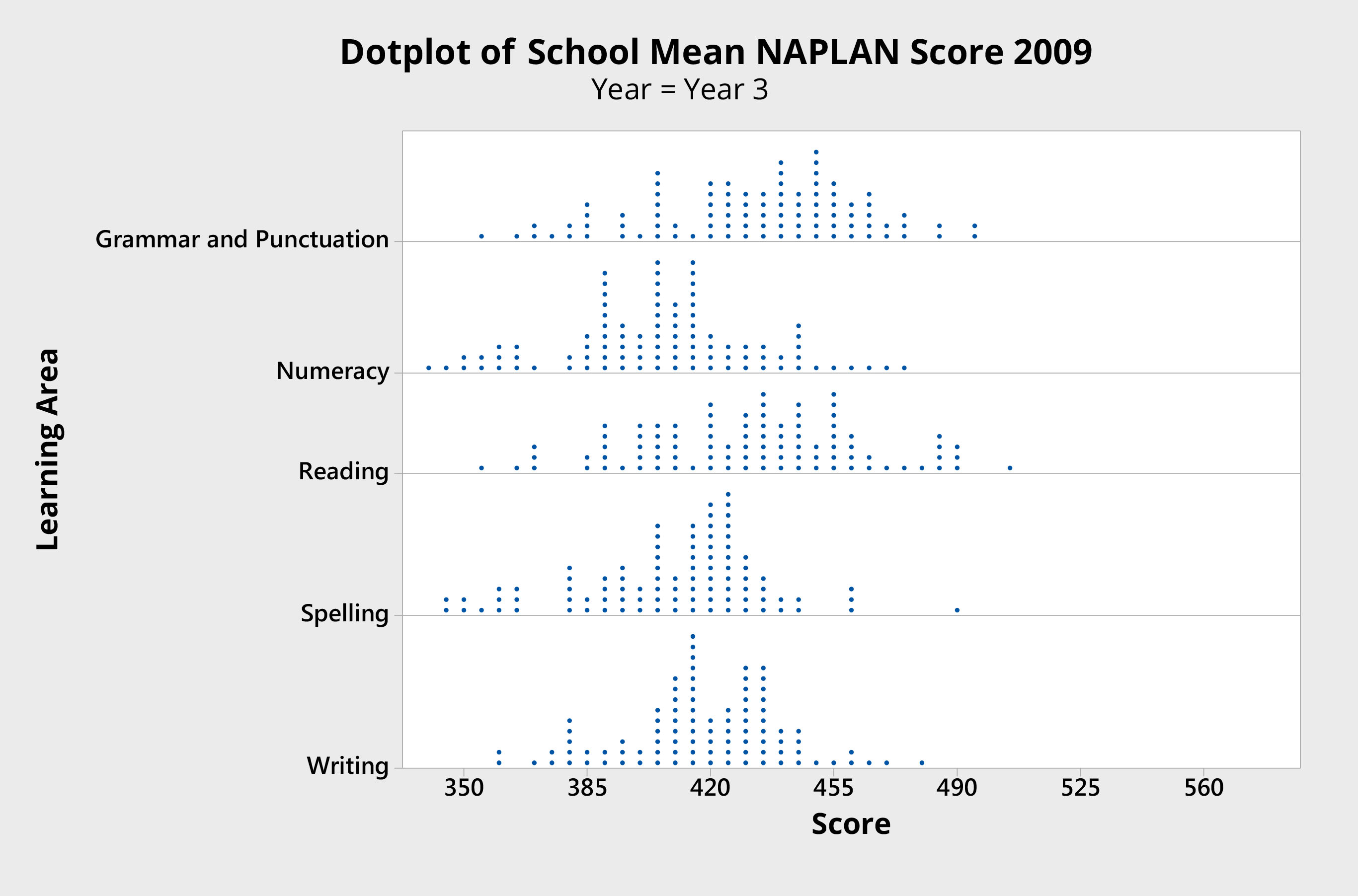
Figure 1 presents a dot plot of mean Year 3 school results, measured across five key learning areas by NAPLAN in 2009. These results are from an Australian jurisdiction and include government-run schools and nongovernment schools. For the purpose of the argument that follows, these data are representative of results from any set of schools, at any level, anywhere.
Figure 1 Dot plot of school mean scores
The first thing to notice is that there is variation in the school mean scores. (Normal probability plots suggest the data appear to be normally distributed, as one would expect.) The system is stable and is not subject to special causes (outliers).
The policy response to variation such as this is frequently a form of tampering. Underperforming schools are identified at the lower ends of the distribution and are subjected to expectations of improvement, with punishments and rewards attached.
This response fails to take into account the fact that data points within the natural limits of variation are only subject to common cause variation.
To single out individual schools (classes, students, principals or teachers) fails to address the common causes and fails to improve the system in any way.
When this approach is extended to all low performing elements, it becomes an even more systematic problem: attempting to chop the tail of the distribution.
Tampering by chopping the tails of the distribution
Working on the individuals performing most poorly in a system is sometimes known as trying to chop the tail of the distribution. This is also tampering.
There are three main reasons why this is bad policy, all of which have to do with not understanding the nature and impact of variation within the system.
Firstly, it is not uncommon to base interventions on mean scores. Yet it is well known within the education community that there is much greater variation within schools than there is between schools. Similarly, there is much greater variation within classes than between classes within the same school. Averages mask variation.
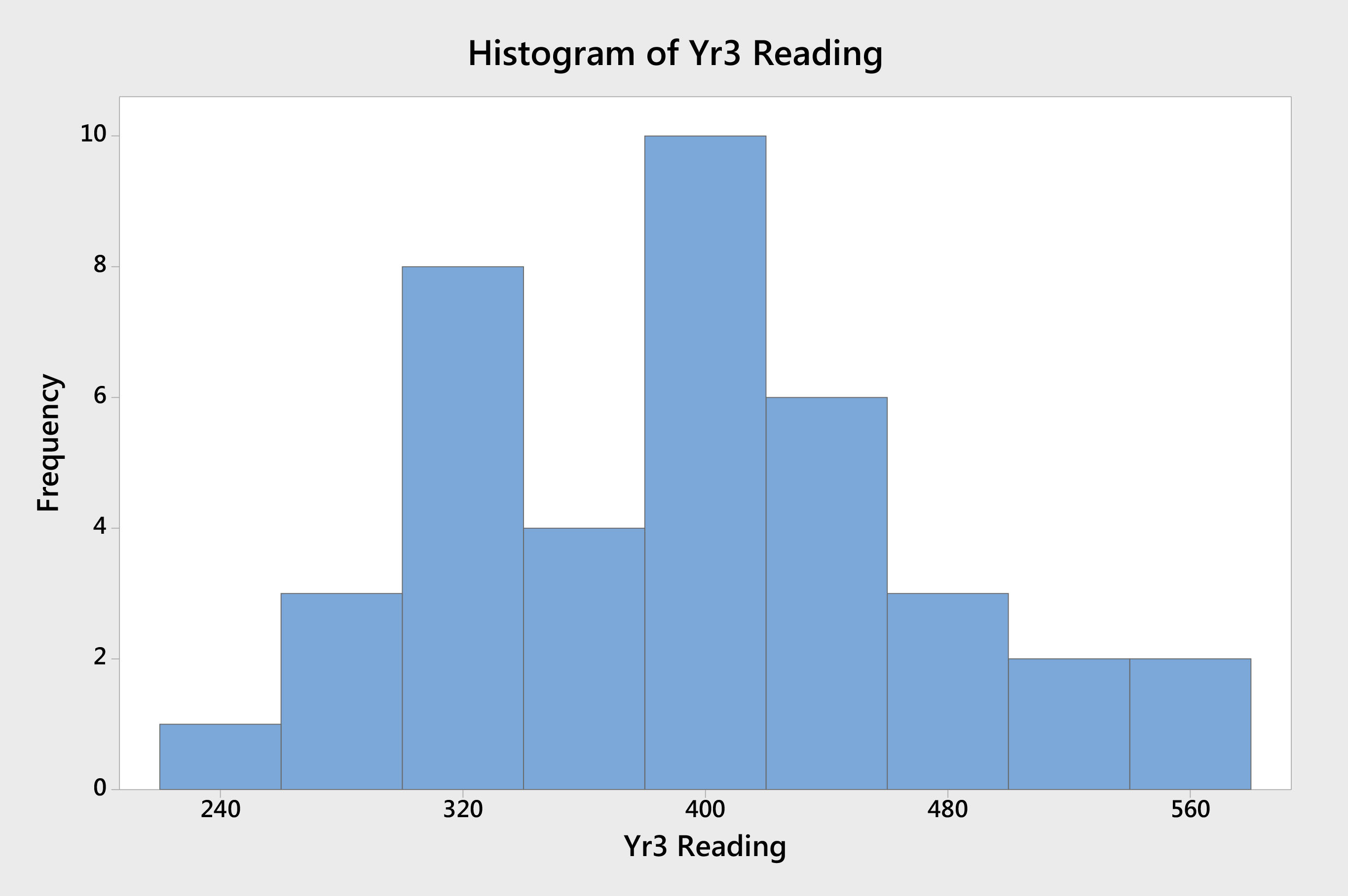
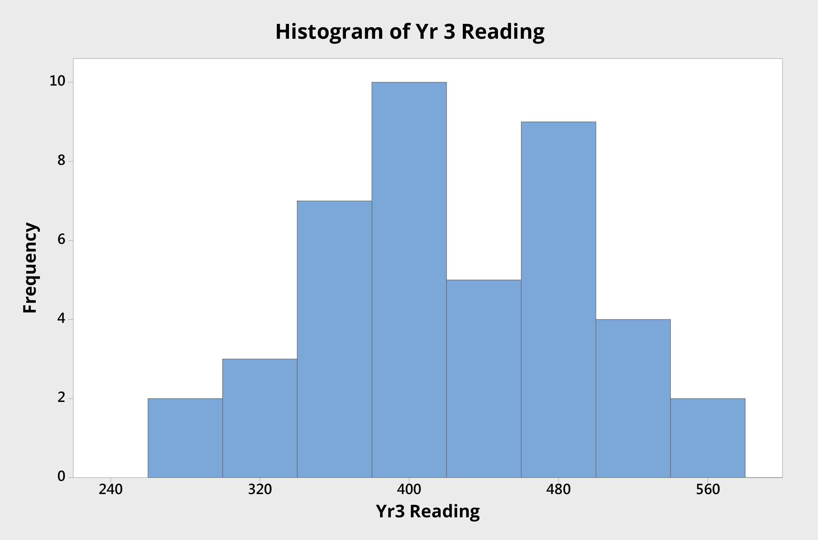
Consider two schools. School A (Figure 2) is performing at the lower end of the distribution for reading scores — with a mean reading score of approximately 390. School B (Figure 3) has a mean reading score approximately 30 points higher.
Figure 2. Histogram of Year 3 student reading scores (School A)Figure 3. Histogram of Year 3 student reading scores (School B)
The proportion of students in each school that is performing below any defined acceptable level is fairly similar. School A, for example, has 12 students with results below 350. School B has seven. In some systems, resources are allocated based on mean scores. Those with mean scores beyond a defined threshold are entitled to resources not available to those with mean scores within certain limits. If School A and School B were in such a system and the resourcing threshold was set at 400, for example, School B could be denied resources made available to School A, simply because its mean score is above some defined cut-off point.
Where schools or classes are identified to be in need of intervention based on mean scores, the nature and impact of the variation behind these mean scores is masked and ignored. If the 12 students in School A receive support, why is it denied to those equally deserving seven students in School B?
Secondly, the distribution of these results fails to show evidence of special cause variation. The variation that is observed among the performance of these schools is caused by a myriad of common causes that affect all schools in the system.
Singling out underperforming schools for special treatment each year does nothing to address the causes common to every school in the system, and fails to improve the system as a whole.
Even if the intervention is successful for the selected schools, the common causal system will ensure that, in time, the distribution is restored, with schools once again occupying similar places at the lower end of the curve. The system will not be improved by this approach.
Thirdly, this approach consumes scarce resources that could be used to examine the cause and effect relationships operating within the system as a whole and taking action to improve performance of the system as a whole.
In education, working on the individuals performing most poorly in a system is a disturbingly common approach to improvement. It never works. A near identical strategy is used within classes to identify students who require remediation. The “bottom” — underachieving — kids are given a special program; they are singled out. Sometimes the “top” — gifted and talented — kids are also singled out for an extension program.
This is not so say that we should not intervene when a school is strugglingor when a student is falling behind. Nor are we suggesting that students and schools who are progressing well should not be challenged to achieve even more. It is appropriate to provide this support and extension to those who need it. The problem is that doing so does not improve the system. Such actions, when they become as entrenched as they currently are, are merely part of the current system.
It should be noted that focussing upon poor performers also shifts the blame away from those responsible for the system as a whole and onto the poor performers.
The mantra becomes one of “if only we could fix these schools/students/families”. The responsibility lies not with the poor performers, but with those responsible for managing the system: senior leaders and administrators. It is a convenient, but costly diversion to shift the blame in this way.
If targeting the tails of the distribution is the primary strategy for improvement, it is tampering and it will fail. Unless action is taken to improve the system as a whole, the data will be the same again next year, only the names will have changed. Over time, targeting the tails of the distribution also increases the variation in the system.
This sort of tampering is not restricted to schools and school systems. It is very common, and equally ineffective, in corporate and government organisations. It is quite common that the top performers are rewarded with large bonuses, while poor performers are identified and fired or transferred. Sales teams compete against each other for reward and to avoid humiliation. Such approaches do not improve the system; they tamper with it.
Tampering by failing to address root causes
Tampering commonly occurs when systems or processes are changed in response to a common cause of variation that is not a root cause or dominant driver of performance.
People tamper with a system when they make changes to it in response to symptoms rather than causes.
It is easy to miss root causes by failing to ask those who really know. Who can identify the biggest barriers to learning in a classroom? The students.
Teachers can be quick to identify student work ethic as a problem in high schools. It is a rare teacher who identifies boring and meaningless lessons as a possible cause. Work ethic is a symptom, not a cause. It is not productive to tackle the issue of work ethic directly. One must find the causes of good and poor work ethics and address these in order to bring about a change in behaviour.
There has been a concerted effort in recent years in Australia to decrease class sizes, particularly in primary schools. Teachers are pleased because it appears to reduce their work load and provides more time to attend to each student. Students like it because they may receive more teacher attention. Parents are pleased because they expect their child to receive more individualised attention. Unions are happy because it means more teachers and therefore more members. Politicians back it because parents, teachers and unions love it. Unfortunately, the evidence indicates that these changes in class size have very little impact on student learning. (See John Hattie, 2009, Visible Learning, Routledge, London and New York.) This policy is an example of tampering on a grand and expensive scale. Class size is not a root cause of performance in student learning.
Managers need to study the cause and effect relationships within their system and be confident that they are addressing the true root causes. Symptoms are not causes.
Every time changes are made to a system in an absence of understanding the cause and effect relationships affecting that system, it is tampering.
Tampering will not improve the system; it has the opposite effect.
This is the third in a series of four blog posts to introduce the underpinning concepts related to variation in systems. In the first post we discussed common cause and special cause variation. The second explored the concept of system stability. In this post, we explore whether a system is capable of consistently meeting expectations. This is an edited extract from our book, Improving Learning.
System Capability
Just because a system is stable does not mean that it is producing satisfactory results. For example, if a school demonstrates average growth in spelling of about 70 points from Years 3 to 5, is this acceptable? Should parents be satisfied with school scores that range from 350 to 500? These are questions of system capability.
Capability relates to the degree to which a system consistently delivers results that are acceptable — within specification, and thus within acceptable limits of variation.
Capability: the degree to which a system consistently delivers results that are within acceptable limits of variation.
Note that stability relates to the natural variation that is exhibited by a system, capability relates to the acceptable limits of variation for a system. Stability is defined by system performance. Capability is defined by stakeholder needs and expectations.
It is not uncommon to find systems that are both stable and incapable; systems that consistently and predictably produce results that are beyond acceptable limits of variation and are therefore unsatisfactory. No doubt, you can think of many examples.
Cries for school systems to “raise the bar” or “close the gap” are evidence that stakeholders believe school systems to be incapable (in this statistical sense) because the results they are producing are not within acceptable limits of variation. However, the results are totally predictable, the system is stable, but the results are unsatisfactory; the system is incapable.
In Australia, NAPLAN defines standards for student performance. National minimum standards are defined to reflect a “basic level of knowledge and understanding needed to function in that year level”.
Proficiency standards, which are set higher than the national minimum standards, “refer to what is expected of a student at the year level”. Depending on the year level and learning area, between two per cent and 14 per cent of students fail to reach national minimum standards. By definition, then, the Australian education system is incapable. It fails to consistently produce performance that is within acceptable limits of variation, because a known proportion of students fails to meet minimum standards, let alone perform at or better than the expected proficiency.
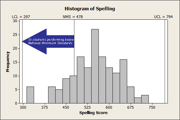
Figure 1 shows the spelling results for 161 Year 9 students at an Australian high school, as measured by NAPLAN. These results fall between the upper and lower control limits, which have been found to be at 297 and 794 respectively. Careful analysis failed to reveal evidence of special cause variation. This system appears to be stable. The national minimum standard for Year 9 students is 478. In this set of data, there are 33 students performing below this standard. Thus we can conclude that the system which produced these spelling results is stable but incapable.
Figure 1 Histogram of Year 9 student NAPLAN scores in spelling, indicating a system that is stable but incapable.
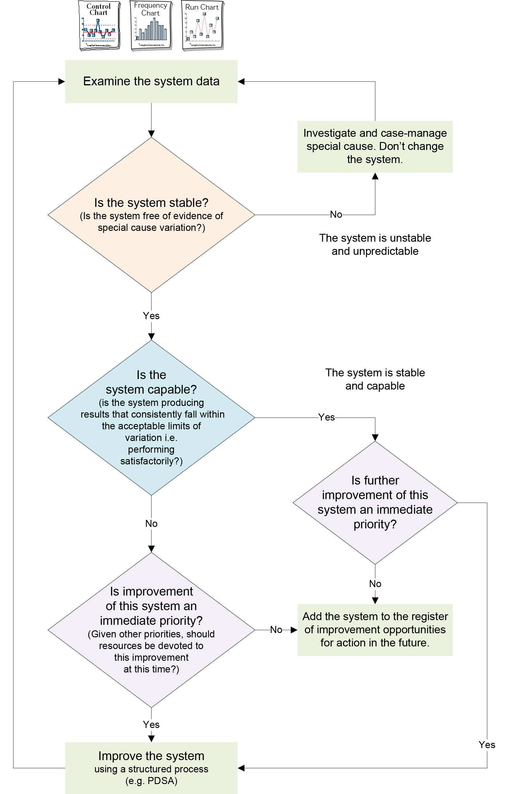
Taking effective action: Responding appropriately to system variation.
With an understanding of the concepts of common cause and special cause variation, responding to system data becomes more effective. The flowchart in Figure 2 summarises an appropriate response to system data.
Figure 2. Flowchart: responding appropriately to system variation
In the next post, we describe what can happen when we don’t respond appropriately to variation – tampering! Making things worse.
This is the second in a series of four blog posts to introduce the underpinning concepts related to variation in systems. In the first post we discussed common cause and special cause variation. In this post, we explain that a stable system is predictable. This is an edited extract from our book, Improving Learning.
System stability
System stability relates to the degree to which the performance of any system is predictable — that the next data point will fall randomly within the natural limits of variation.
A formal definition can provide a useful starting point for exploring this important concept.
A system is said to be stable when the observations fall randomly within the natural limits of variation for that system and conform to a defined distribution, frequently a normal distribution.
All systems exhibit variation in all four types of measures: results, perceptions, processes, and inputs.
Variation within groups
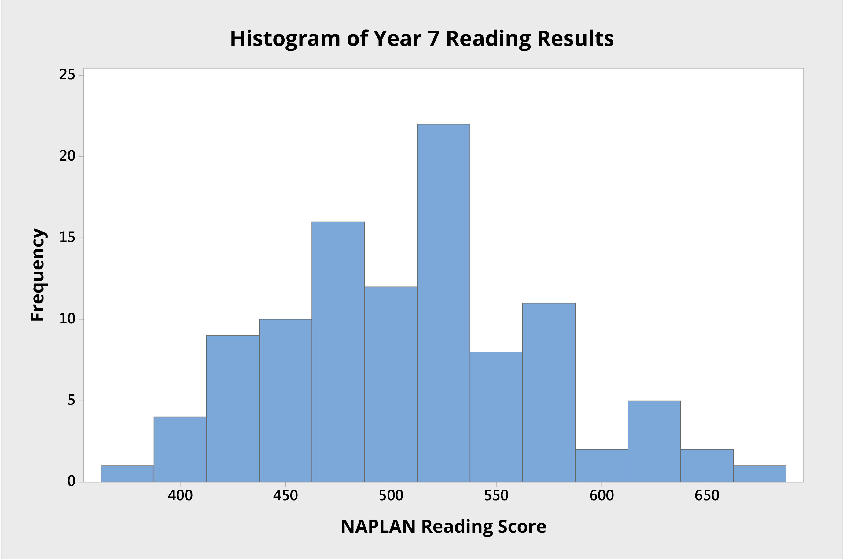
Consider, for example, the student results in Figure 1, which show the reading scores for 103 students attending an Australian high school. Each student was tested as part of NAPLAN when they were in Year 7.
Figure 1 Histogram of Year 7 individual student NAPLAN reading scores from an Australian high school.
The histogram shows the variation in student performance, from which we can see:
the mean score is approximately 510 points; and
the data seem to be roughly normally distributed, as there is a stronger cluster of scores around the mean score, and the curve appears roughly bell shaped.
A stable system produces predictable results within the natural limits of variation for that system.
If we use the histogram to study the variation in student NAPLAN results, we can assume that, if there were additional students in that group, their results would very likely fall within the distribution shown.
Furthermore, if nothing is done to change a stable system, it is rational to predict that future NAPLAN reading performances will be similar, both in the mean or average performance and in the range of variation evident in the results.
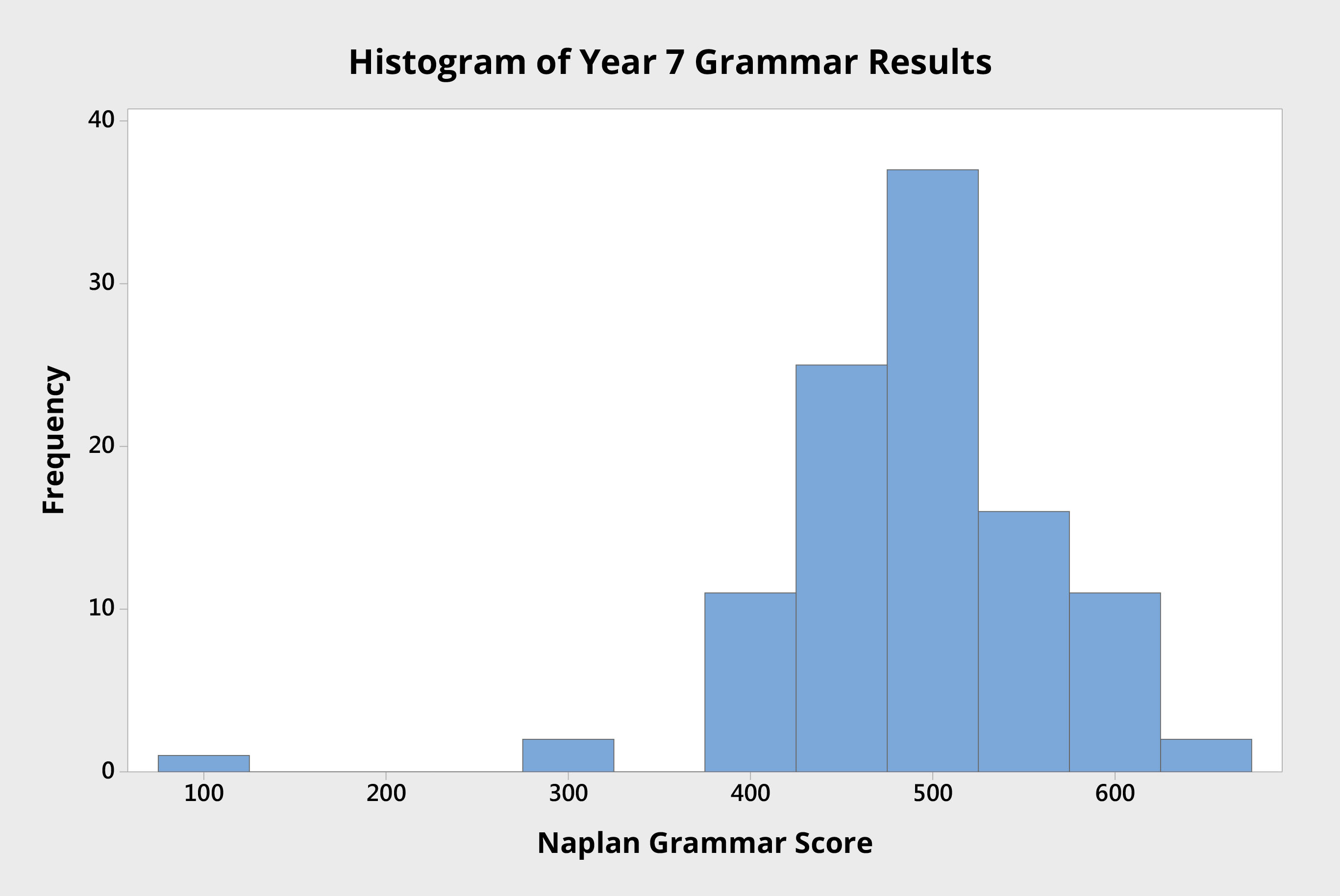
Figure 2 Histogram of Year 7 individual student NAPLAN grammar scores from an Australian high school.
The histogram in Figure 2 shows the grammar scores of the same group of Year 7 students. Here the mean score is about 500 points.
Notice here the presence of a single student with a score of approximately 100. This data point appears to be an outlier: it is noticeably different to the other data points.
One could reasonably assume that this data point represents something out of the ordinary, that the causes that led to this result are different to those experienced by the remainder of the system.
Given that this data point is so different to the others, investigation is called for, and is likely to reveal a specific reason, an assignable cause. Where specific causes can be identified, they are called special causes or assignable causes. In this instance, investigation revealed that this student had scored about 200 points below expectation due to illness on the day of the test.
These examples of system stability, within groups, relate to measures of students’ learning at a particular point in time.
Variation between groups
The variation that is evident between groups is often of great interest. For example, we may be interested in variation between classes of the same grade or year, or between schools in different districts or states.
In these instances, the focus is no longer on variation within a set of data points, but upon differences in variation that is evident between groups (multiple sets) of data points.
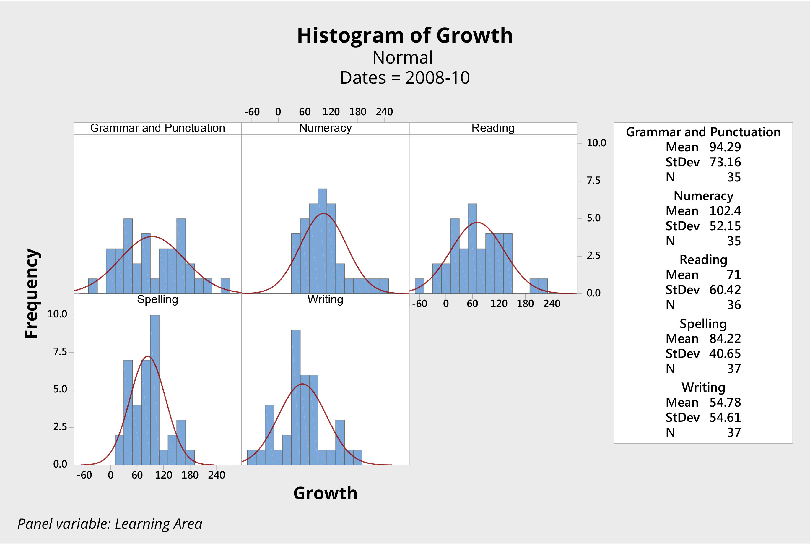
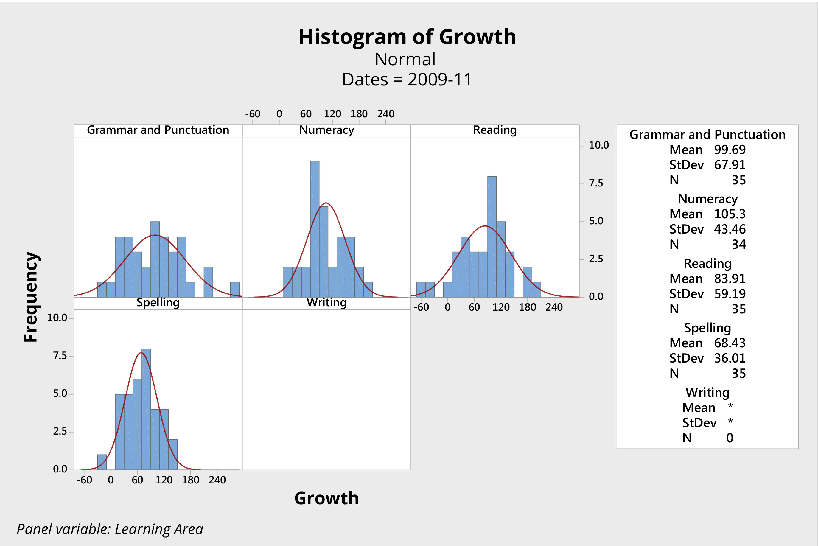
Consider, for example, the sets of histograms presented in Figures 3 and 4. Both come from the same primary school, and both represent the growth in students’ scores in key learning areas, as measured by NAPLAN, over the two-year period from Year 3 to Year 5.
Figure 3. Histograms of student growth literacy and numeracy years 3 to 5, 2008 – 2010, NAPLAN individual student scores from an Australian primary school.Figure 4. Histograms of student growth literacy and numeracy years 3 to 5, 2009 – 2011, NAPLAN individual student scores from an Australian primary school.
The first group of students (Figure 3) was initially tested in 2008, when the students were in Year 3. This same group of students was tested again in 2010, when they were in Year 5. The histograms show the difference, or growth, in scores over that two-year period.
The second group of students (Figure 4) is a year younger. These students were tested in 2009, when they were in Year 3, and again in 2011, when they were in Year 5. (Due to differences in the testing of writing between 2009 and 2011, growth in this area was not evaluated for the second group).
Has one group of students performed better than the other? These data look very similar. Analysis fails to show any significant difference between these two groups of students in either the mean score or variation for each of the four learning areas.
With two different groups of students, this school produced essentially the same results in terms of student growth over the two two-year periods. The data are practically the same for each group, only the names of the students are different.
Consider the scores for grammar and punctuation, for example. For both groups of students, the system produced a mean score of about 95 and a range from approximately -70 to 250. It appears the system produced consistent results with a mean growth of approximately 95 points and natural limits of variation plus or minus approximately 160. The story is similar for the other three learning areas.
We can reasonably predict that, unless something changes significantly at this school, the next group of students will again produce almost identical results.
The system is thus said to be stable — the points fall predictably between the natural limits of variation for the system.
Variation over time
Outliers, trends and unusual observations in time-series data can indicate the presence of special cause variation. Where these exist, the system is not stable.
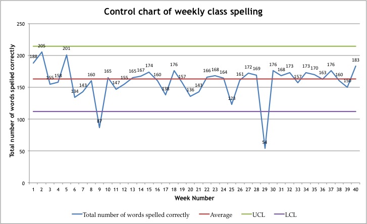
So far we have used the histogram to help us to study variation in a system. We can also study system variation by plotting data as a time series using a run chart (line graph) or control chart as in Figure 5. Here the class total of correct spelling words per week is plotted over weekly intervals.
Figure 5. Control Chart of weekly class spelling total.
Notice the dips in the number of correct words at weeks nine and twenty-nine. One could reasonably seek explanations and learn that it was, for example, the week of the school camp, or an outbreak of influenza that lead to student absences resulting in lower numbers of correct words. These would be examples of special cause variation.
Instances of special cause variation in time series data can be revealed by patterns or trends in the data, including:
a series of consecutive data points that sequentially improve or deteriorate; and
an uncommonly high number of data points above or below the average.
If there is an unexplained pattern in the data, this is evidence of special cause variation and investigation is justified. Such a system is said to be unstable.
If special cause variation is absent, future performance can be predicted with confidence. This performance will fall within the natural limits of variation for that process. If special cause variation is absent, or the presence of any special causes is explained, and system performance can be confidently predicted, the system is said to be stable.
Where unusual data points or trends have not been explained, any predictions of future performance will be less reliable. In such cases, the system is said to be unstable. Confident prediction is not possible for an unstable system.
In the next post in this series, we explain the notion of system capability. These concepts, stability and capability, along with an understanding of common cause and special cause variation, discussed in the pervious post, are fundamental to preventing tampering with systems. Tampering is a common practice in school education systems (and elsewhere), and usually makes things worse!
This is the first in a series of four blog posts to introduce the underpinning concepts related to variation in systems. In this post we discuss common cause and special cause variation.
These concepts provide a foundation for understanding and responding to variation in systems. In particular these concepts are fundamental to understanding the notions of stability, capability and avoiding tampering; each of which will be discussed in subsequent posts.
We also discuss simple tools that allow us to ‘see the variation’ in systems and processes. Understanding and applying these concepts and tools helps us to respond appropriately to data to continually improve, rather than risk making things worse!
Variation is everywhere
Variation is evident in all systems. No two real things are identical.
Consider, for example, the standard AA size battery. AA size batteries are 50 mm long and 14 mm in diameter, as defined by international standards. They all look the same and are perfectly interchangeable. Yet each individual battery cannot be exactly 50 mm long and exactly 14 mm in diameter. Most people don’t care that one battery is 50.013 mm long and another is 49.957 mm long; both will fit perfectly well in their flashlight or remote control. To detect these differences – the variation – precise measuring equipment is required.
A factory will produce batteries with a length that has a calculable mean, an observable spread, and a clustering of lengths around the mean. All determined by the manufacturing process.
While two observed things are never identical, we can think of them as being identical when our measurement system is unable to detect difference, or when any differences are of no practical significance.
Sometimes variation is more evident. The average height of an Australian 13-year-old boy is approximately 156 cm. Very few 13-year old boys are precisely 156 cm tall, but nearly all will be within about three cm of this average height. This phenomenon is known as the natural limits of variation. In this case; a typical 13 year old boy’s height falls naturally within a range of heights centered at 156 cm and varying up to about three cm above and below this value.
All processes and systems exhibit natural variation. In both these examples, a battery’s dimensions and the height of a 13-year-old boy, the characteristic being measured is different from observation to observation. Yet, as a set of observations they conform to a defined distribution, in this case the normal distribution.
The factors that cause this variation, from observation to observation, come from the system. In the case of AA batteries, it is the system of manufacturing; variation in the height of 13-year-old boys comes from genetic, societal and environmental factors. In both cases, it is the system that produces natural variation.
In a similar manner, systems produce variation in perceptions and performance. Figure 1 shows the perceptions of teachers in a school regarding the degree of engagement of their students. The variation in perceptions is evident.
Figure 1. Consensogram of perceptions of student engagement.
It is the system that produces natural variation. To understand this variation, it is necessary to understand the system. No examination of individual examples can explain the system.
Common cause variation
Variation observed in any system comes from diverse and multitudinous possible causes.
The fishbone diagram can be used to document the many possible causes of variation. The fishbone diagram in Figure 2, for example, lists possible causes of variation in student achievement.
Figure 2: Fishbone Diagram of Possible Causes of Variation in Student Achievement
Each of the causes affects every student to a greater or lesser degree. Students respond to each cause in different ways, so the impact is different for each student. For example, some students may be sensitive to background noise while others are not. Some students may struggle to balance family responsibilities, work and school, while for others this not an issue. All students will be affected to some degree by their prior learning and their attitude towards the subject matter. The key point, however, is that every student may be affected to some degree by every cause. It is how all of the causes come together for each individual student that results in the variation in student achievement observed across the class. Causes that affect every observation, to greater or lesser degrees, are called common causes.
Common cause variation is the variation inherent in a system. It is always present. It is the net result of many influences, most of which are unknown.
In general, it is the combination of the common causes of variation coming together uniquely for each observation that results in the distribution in the set of data points. That is, the set of observations conform to a defined distribution. Not surprisingly, this distribution is frequently a normal distribution.
Figure 3 shows a histogram or frequency chart of the variation in year 7 students’ reading test scores from an Australian school, as measured by a national standard test. You can see the natural spread of variation in this measure of the students’ reading performance.
Figure 3. Histogram of Reading Results Year 7
For any single data point — for example, a single student’s test result — it is not possible to identify any specific cause that led to the result achieved. Importantly, it is not worth trying to identify any such single cause.
The system of common causes determines the behaviour and performance of the system. These causes include the actions and interactions among the elements of the system, as well as features of the structure of the system and those of the containing systems.
Special cause variation
The other type of variation is special cause variation.
When a cause can be identified as having an outstanding and isolated effect — such as a student being late to school on the morning of an assessment — this is called special cause variation or assignable cause variation. A specific reason can be assigned to the observed variation.
Special cause variation is variation that is unusual and unpredictable. It can be the result of a unique event or circumstance, which can be attributed to some knowable influence. It is also known as assignable cause variation.
Special causes of variation are identifiable events or situations that produce specific results that are out of the ordinary. These out of the ordinary results may be single points of data beyond the natural limits of variation of the system, or they may be observable patterns or trends in the data.
Figure 4 hows a histogram or frequency chart of the variation in year 7 students’ grammar test scores from the same Australian school, as measured by a national standard test. You can see the natural spread of variation in this measure of the students’ grammar achievement. You can also see one student’s results significantly below the vast majority of scores. That single observation suggests a special cause of variation and is worthy of investigation.
Figure 4. Histogram of Grammar Results Year 7
Where there is evidence of special cause variation in a set of data, it is always worth investigating. The impact of a special cause may be detrimental, in which case it may be appropriate to seek to prevent occurrence of this cause within the system. The impact of a special cause may also be beneficial, in which case it may be worth pursuing how this cause can be harnessed to improve system performance.
Special causes provide opportunities to learn. The lesson might be as mundane as “that batch of electrolyte was contaminated”, or it might be as exciting as the discovery of penicillin, or a new strategy for learning.
In summary:
Variation is evident in all observations – from physical dimensions to student behaviour and academic achievement. Most observed variation is due to common causes – those causes that affect every observation, to differing degrees. Sometime, there are specific and identifiable causes of variation – these are known as special causes.
These two key concepts – common and special cause variation – are fundamental to responding to system variation appropriately. An understanding of these concepts is critical to affecting demonstrable and sustainable improvement. They underpin an understanding of system stability, capability and tampering, which will each be discussed in future blog posts. Where these concepts are not understood, attempts to improve performance frequently make things worse.
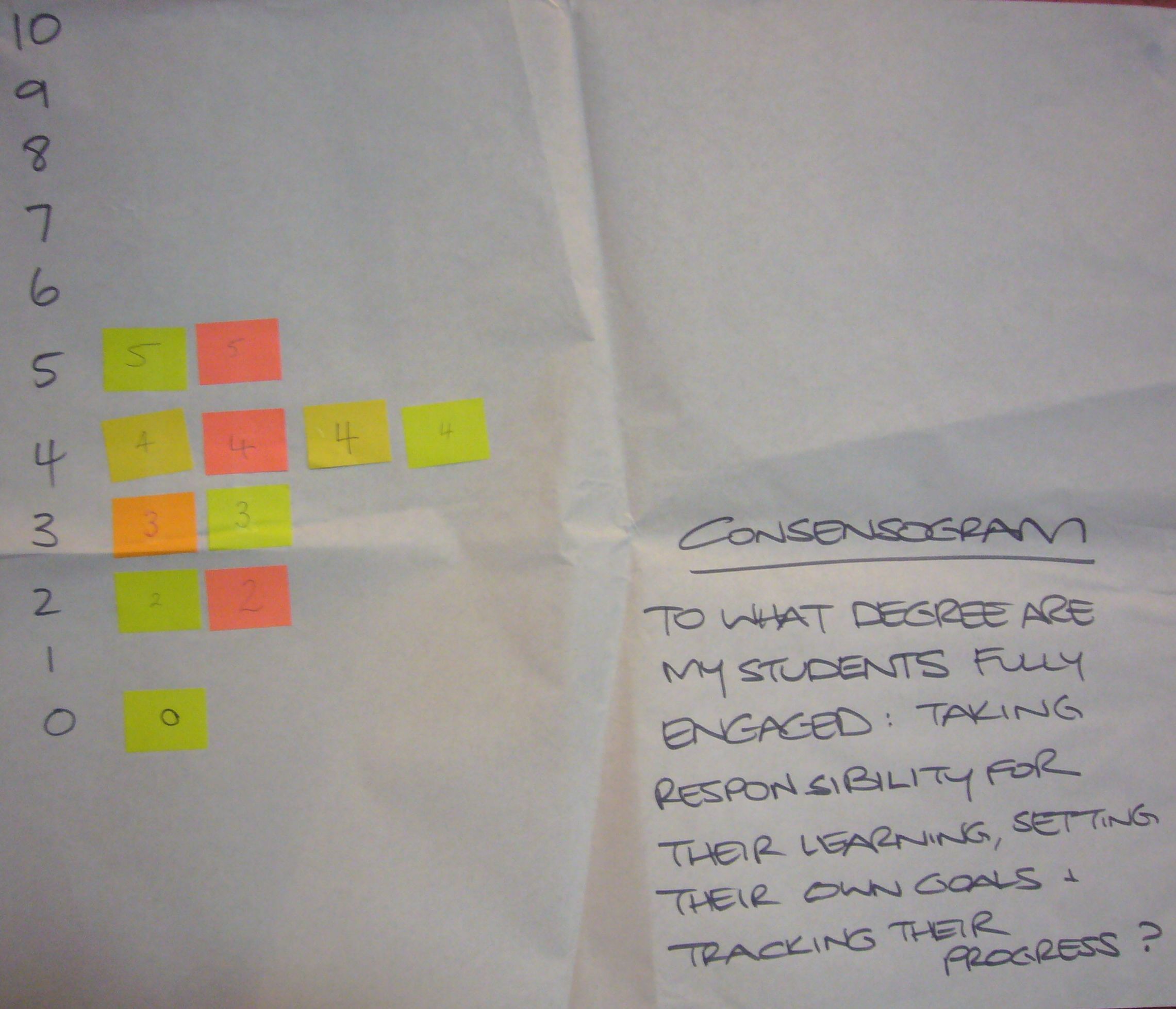
Quality learning provides administrators, educators, and students with the thinking and practical quality improvement tools necessary to continually improve schools, classrooms and learning. The Consensogram is one of these powerful and easy-to-use quality improvement tools.
A consensogram
The Consensogram facilitates collaboration to support planning and decision making through the collection and display of data. It can be used to gain important insights into the perceptions of stakeholders (most often relating to their level of commitment, effort, or understanding).
The quick-to-construct chart reveals the frequency and distribution of responses. Although anonymous, it allows individuals to view their response in relation to the others in the group.
The Consensogram gives voice to the silent majorityand perspective to the vocal minority.
At QLA, we use frequently use the Consensogram: applying it to diverse situations for the purpose of obtaining important data to better inform ‘where to next’.
How to
Predetermine the question relating to the data to be collected. Make sure the question is seeking a personalised response – it contains an “I” or “my” or “me”. We want people to give their view. E.g. “To what degree am I committed to…” or “To what degree do I understand…” It can help to begin the question with ‘To what degree…’
Predetermine the scale you wish to use. The scale may be zero to 10 or a percentage scale between zero and 100 percent.
Issue each person with one sticky note. Make sure the sticky notes are all the same size. Colour is not important.
Explain that you want people to write a number on their sticky note in response to the question posed.
No negative numbers.
If using the zero to 10 scale: the number should be a whole number (not a fraction e.g. 3¾ or 3.75, 55%), and a six or nine should be underlined so they can be distinguished.
If using the zero to 100% scale, the numbers should be multiples of ten percent, i.e. 0%, 10%, 20%, and so on.
Names are not required on the sticky notes.
Ask people to write down their response. This shouldn’t take long!
Collect the sticky notes and construct the Consensogram, usually on flip chart paper. Label the consensogram with the question and a vertical axis showing the scale.
Interpret the Consensogram with the group and use it to inform what to do next.
Capture a record of your Consensogram by taking a photograph or saving the data on a spreadsheet. You can use a Consensogram template.
Some examples
Students feeling prepared for high school
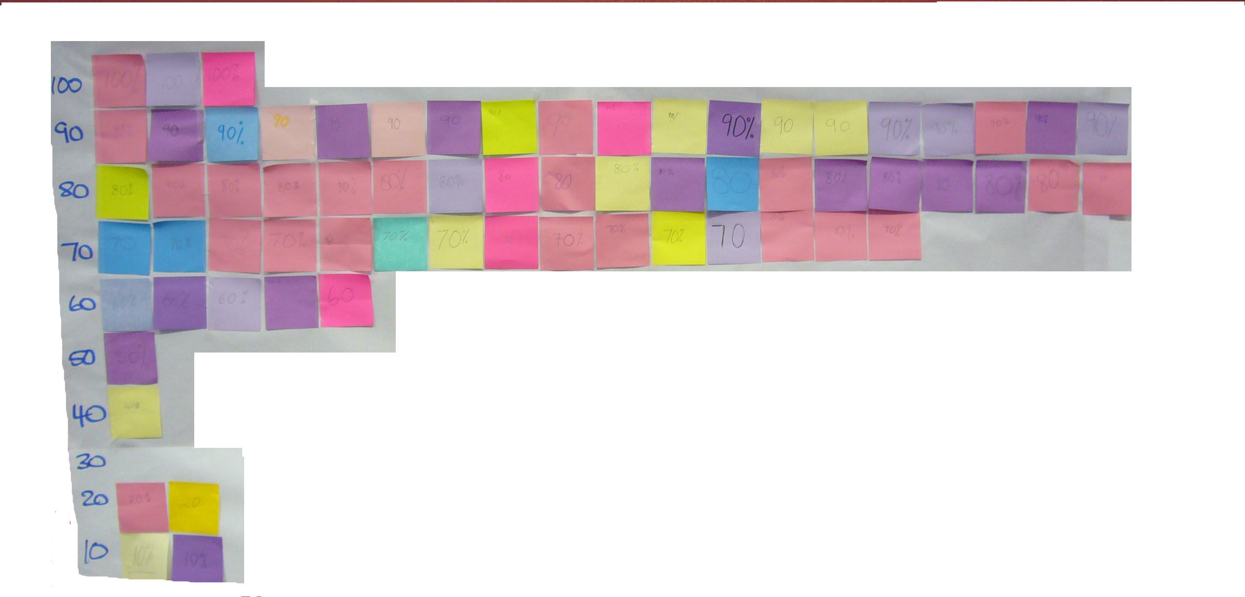
Consensogram: students feeling prepared for high school
This first example was prepared by a classroom teacher to determine how confident Year 6 students were feeling about their transitioning to high school.
So what do the data reveal?
There is significant variation; the students believe they are prepared to different degrees for their move to high school (scores range from 10 to 4).
There is one outlier (special cause) – that is; one student who is having a very different experience to others in the class (giving a rating of one). They report that they feel unprepared for the transition.
So where to next?
There is opportunity to improve student confidence by working with the whole class to identify and work together to eliminate or minimise the biggest barriers to their feeling prepared.
There is opportunity to invite the student who is feeling unprepared to work with the teacher one-on-one (case manage) to address their specific needs for transiting. This student should not be singled out in front of the class, but an invitation issued to the whole class for that individual to have a quiet word with the teacher at a convenient time. The ensuing discussion may also inform the transitioning process for the rest of the class.
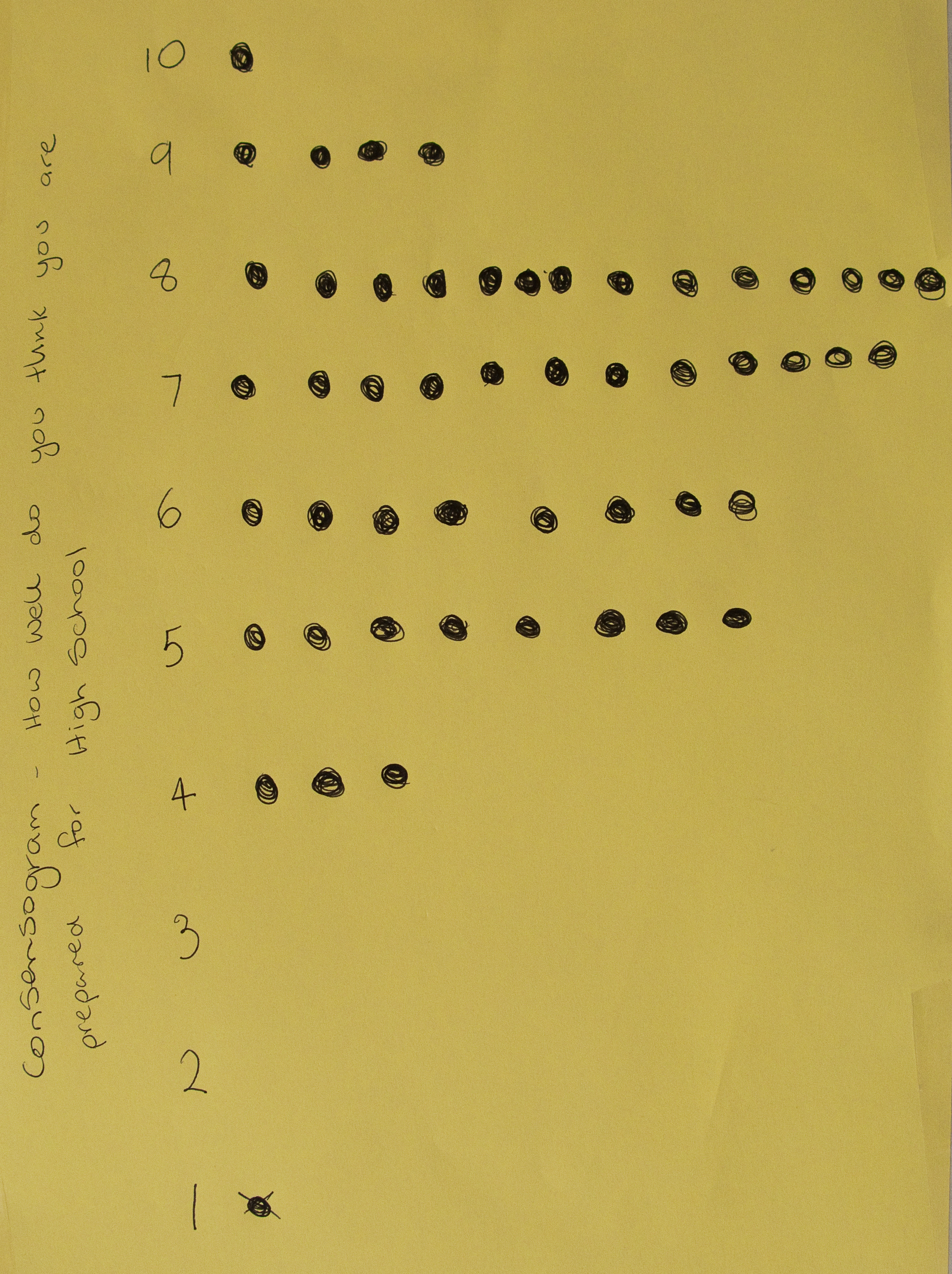
Student engagement
This example was created during a QLA professional development
Consensogram: how engaged are students in my classroom?
workshop with a small group of 11 teachers.
The question was: “To what degree are my students fully engaged: taking responsibility for their learning, setting their own goals and tracking their progress?”
So what do the data reveal?
There is variation; the teachers believe their students are at different levels of engagement in their classroom.
The data appears normally distributed data (a bell curve); there are no outliers (special causes) – that is; none of the teachers are having a very different experience to others in the group.
So where to next?
There is opportunity to improve student engagement; all of the data points are below 5 on the scale.
This data can help the group to understand the agreed current state and can motivate people to engage with improvement. It can also provide baseline data to monitor the impact of improvement efforts in the future.
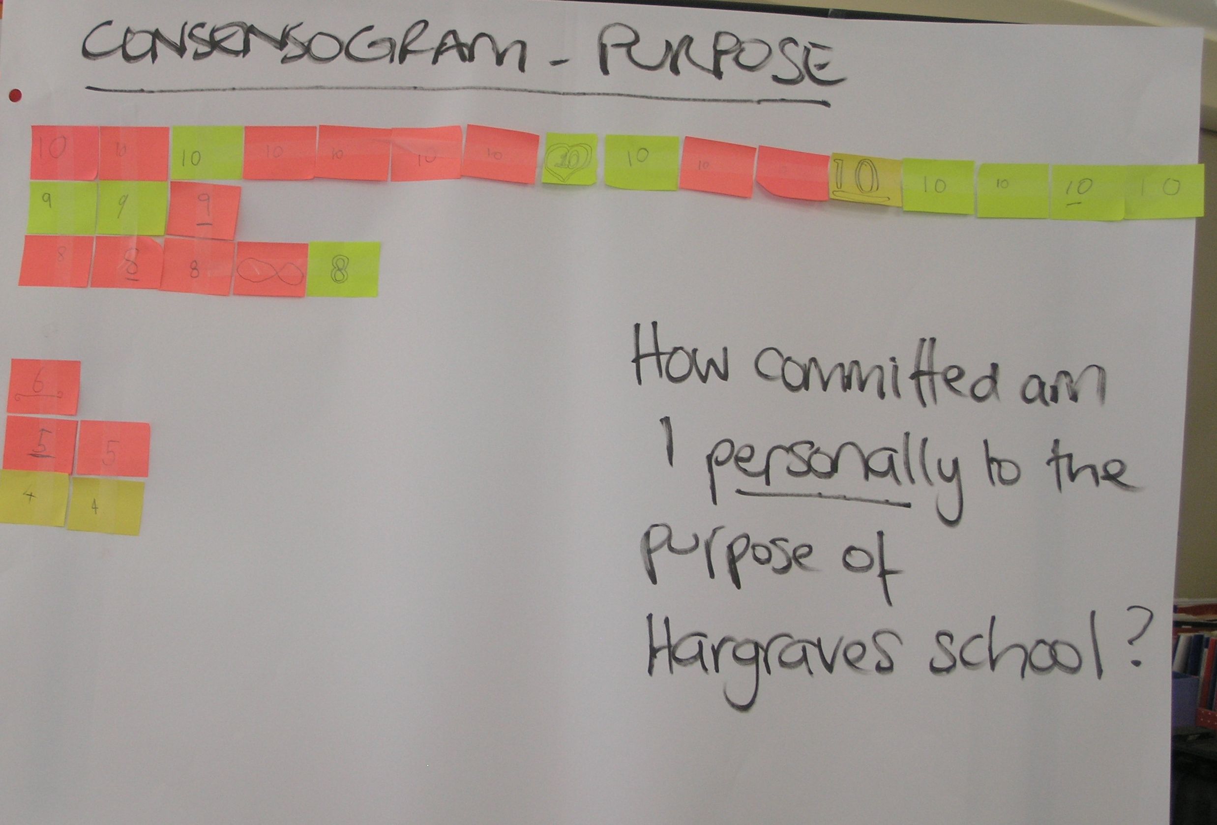
Commitment to school purpose
This example was created during school strategic planning with key stakeholders of a small school (parents, staff and students). A draft
Consensogram: how committed am I to our school purpose?
purpose statement was developed using stakeholder input (using a P3T Tool). The Consensogram was then used to measure the level of commitment to the draft statement. The question was: “How committed am I personally to the purpose of the school?”
The use of the Consensogram averted the need for long, frequently unproductive dialogue. It revealed the following:
There is variation; the stakeholders exhibit different levels of commitment to the school purpose.
Most are stakeholders are highly committed (the majority indicating a commitment level of 8-10).
A group of five stakeholders are less committed (a commitment level of 4-6). Their experience may be different to others in the group.
So where to next?
This presents an opportunity to invite the stakeholders with a different experience to share. It is very likely something can be learned to improve the purpose statement for everyone.
Learn more…
Watch a video example of a Consensogram being used for school planning (Hargraves System Mapping) on YouTube.
There are four types of measures necessary for monitoring and improving systems such as schools and classrooms. These are:
Performance measures
Perception measures
Process measures
Input measures.
Performance and perception measures are generally well understood within schools; not so process and input measures. This post seeks to illuminate the use and significance of each type of measure. It is an edited extract from our forthcoming book IMPROVING LEARNING: A how-to guide for school improvement.
Performance Measures
Performance measures are defined to be:
measures of the outcomes of a system that indicate how well the system has performed.
Performance measures relate to the aims of the system. They are used to quantify the outputs and outcomes of the system. In this way, performance measures relate to the key requirements of stakeholders as reflected in the aims of the system.
Examples of performance measures in a school include:
student graduation and completion rates
student results in national, state and school-based testing
expenditure to budget
student and staff attendance.
Performance measures answer the question:
how did we go?
They are collected and reported for three reasons:
To understand the degree to which the aims of the system are being met
To compare performance of one system with that of another similar system
To monitor changes in performance over time.
Performance measures have two major deficiencies: they report what has happened in the past; and they generally provide no insight into how to improve performance. For these reasons, we need other types of measures as well.
Perception Measures
Perception measures are defined to be:
measures collected from the stakeholders in the system in order to monitor their thoughts and opinions of the system.
Perception measures provide insights into peoples’ experience of the system. Given that people make choices based on their perceptions, whether these are accurate or not, perception measures provide valuable insights that can be useful in explaining and predicting behaviour.
Perception measures are collected and reported for three reasons:
To understand the collective perceptions of key stakeholder groups
To identify perceived strengths and opportunities for improvement
To monitor changes in perceptions over time.
For schools, it is important that data are collected and reported regularly regarding the perceptions of staff, students and families. This data can include:
opinions regarding the school’s services
satisfaction with the school and its operation
thoughts and opinions about specific aspects of the school.
Perception measures answer the question:
what do people think of the system?
Note that care is required to ensure adequate random samples are collected for perception data to be reliable.
Process Measures
Process measures are defined to be:
measures collected within the system that are predictive of system performance and which can be used to initiate adjustments to processes.
Process measures are used to monitor progress and predict final outcomes. Most importantly, process measures are used to identify when changes are required in order to bring about improved performance.
Examples of process measures in schools include:
progressive student self-assessment of knowledge and skills, such as ongoing self-assessment using a capacity matrix
practice tests
teacher assessment of student progress
home learning and assessment task completion rates
monthly financial reports.
Notice that at the classroom level, process measures relating to learning are also known as ‘formative assessments’ – assessment used to inform the learning and teaching processes. These short, sharp and regular assessments are used to identify what to do next to improve the students’ learning progress.
Process measures are collected and reported regularly. This enables intervention when a process appears to be at risk of delivering unsatisfactory outcomes — before it is too late. With student learning this is critical so that mediation — improvements to learning — can be made, ensuring that high levels of learning are maintained.
Process measures answer the question: how are we going?
Input Measures
Input measures are defined to be:
measures collected at the boundary of the system to quantify key characteristics of the inputs that affect system operation.
Inputs to a system affect system performance. In the manufacturing sector, the key characteristics of important system inputs – such as material thickness or lubricant viscosity – can be controlled. Other key process input variables cannot be controlled and process adjustments are necessary based on measurements of these inputs. For example, farmers cannot control rainfall, but they can adjust their rates of irrigation based on rainfall measurements.
Teachers cannot control the prior learning of their students, but they do adjust their classroom processes based on this input characteristic. Similarly, very few schools can control the value that their students’ families place on education, but they can adjust school processes based on data about this.
Input measures — data relating to critical characteristics of key inputs to a system — are required to ensure that appropriate actions are taken within the system to accommodate changes and variation in inputs. They are also required if systems are to become robust to input variation.
The core process in a school is learning (not teaching). The learning process is subject to enormous variation in inputs. Key input variables include students’ prior learning, motivation to learn, family background, home support and peer pressure, to name a few.
Any classroom of students will display enormous variation in these inputs. It is not uncommon, for example, to have a class of 13-year-olds with chronological reading ages varying from seven to 18 years. Understanding input variation is crucial to designing learning processes that cater to the many and varied needs of all students.
At a whole school level, there is variation among teachers. Teachers’ knowledge of the content they are required to teach is not uniform, nor is their knowledge of students’ learning processes or the programs in use at the school. Experience with school and education system compliance requirements can also be highly variable. School processes need to take account of this input variation.
Like process measures, input measures are used to make adjustments to system and process design and operation in order to ensure consistently high performance.
Input measures answer the question: what are the key characteristics of the inputs to the system?
To recap, there are four sets of measures that can be used for monitoring and improving systems:
Performance measures
Process measures
Perception measures
Input measures.
Taken together, these measures provide deep insight into the performance, operation, and behaviour of a system. These measures provide a voice with which the system can speak about its behaviour, operation and performance. Importantly, these measures support analysis and prediction of future system behaviour and performance.
The four sets of system measures can be collected for a whole system as well as for subsystems within it. In school systems, this means that these data can be collected at the state, region/district, school, sub-school, classroom, and student levels.
Watch a video that describes these four types of measures.