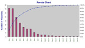
A Pareto chart is a column chart in which the plotted values are arranged from largest to smallest. It is used to highlight the most frequently occurring events, ideas, causes, etc.
The Pareto chart is named after Vilfredo Pareto, an Italian economist, who over a century ago observed that 80 per cent of the land was owned by 20 per cent of the population. This observation was generalised to become the 80-20 rule, or the Pareto principle.
This general principle suggests that 80 per cent of the variation comes from 20 per cent of the causes. For example, most school principals know that 80 per cent of student behaviour problems in a school come from 20 per cent of the teachers.
This MS Excel template enables you to create and save an electronic version of your Pareto Chart.


Most resources on this website are free. For some resources, such as this, we require you to register so that we may keep you informed of Quality Learning news and new resources. Should you choose, you will be able to opt out of our communications at any time.